During the holidays, hundreds of retailers are vying for consumers’ attention, bombarding them with a myriad of discount sale information. During the peak holiday shopping season, up to 50% of content goes unseen compared to 41% for the rest of the year. It has never been more important for companies to ensure users can easily navigate your promotions. Here are some quick tips and ideas to help optimize travel deals for the upcoming season.


1. Improve text readability

Although images do a great job of elevating content, it can also negatively impact your users' experience, especially if they are being used as clickable blocks and tiles for your deals. Using cluttered images can greatly decrease the readability and legibility of the text that is meant to draw your users’ attention to deals. 

Our advice: carefully curate and choose your images so that text is placed on a clean, uncluttered area. Alternatively, allow for each block to hold white space for text. When in doubt, less is more.

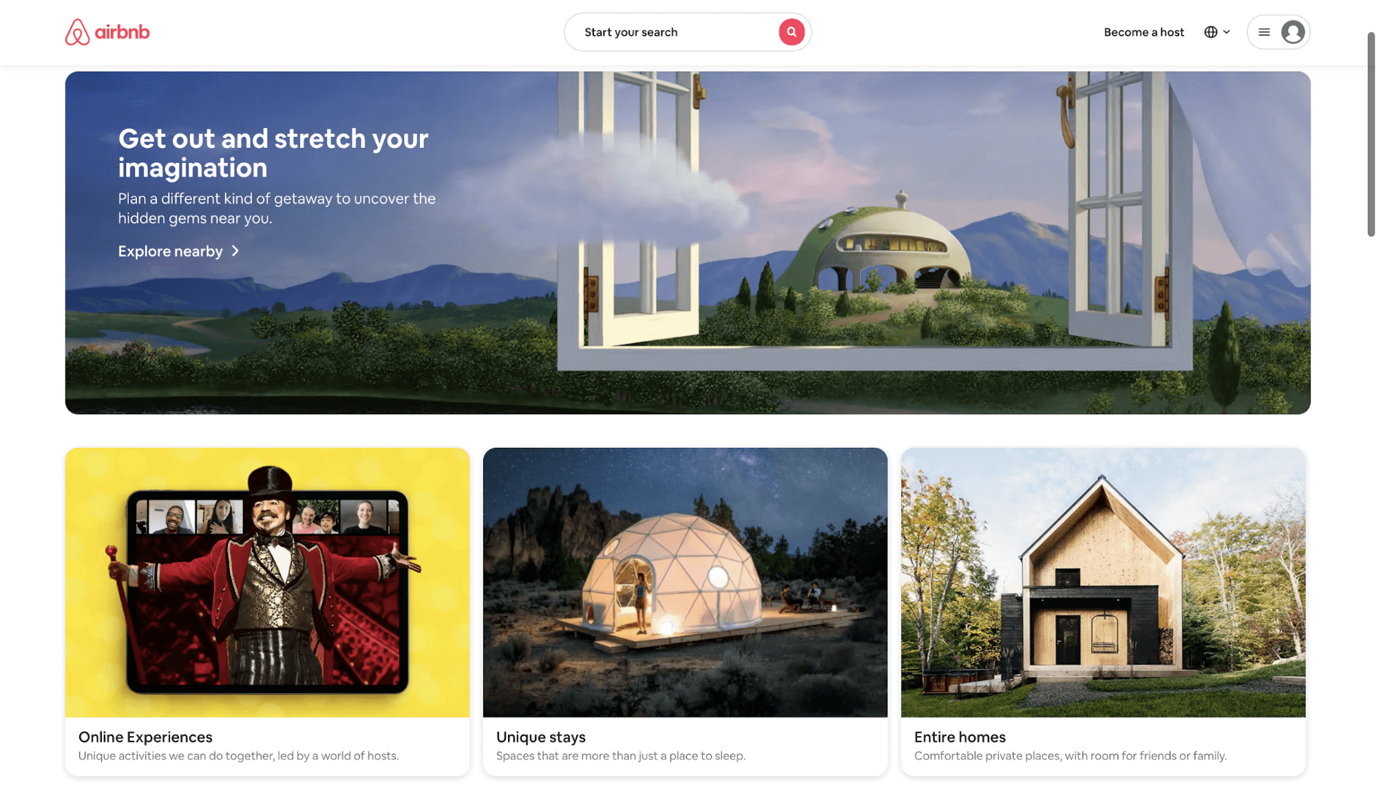
Clean, easily legible text on Airbnb's homepage helps you optimize travel deals

Here, on Airbnb's homepage in September 2020, you can see that the text is always easily legible, whether on an image or illustration. On the hero image, the text is strategically placed on an uncluttered area of the image so it's easy to read and stands out. For the image blocks below the main hero, Airbnb decided to place the text on white space below the images instead. That way the text doesn't compete with the images, stands out to viewers, and provides a clear CTA for customers to navigate to a specific category page. 

2. Allow users to filter deals

Rather than throw a slew of deals at your users, surface them in different and dynamic ways that allow the user to choose deals from narrower categories. Carousels can be an effective way to surface content, but isn’t always an effective way to navigate and find specific deals. 

More likely than not, users have done a lot of research (or have had a lot of practice) booking travel and have a rough idea of what they are looking for. Users may also have sketched out a booking window or destination. If users are destination-agnostic, they are likely to be spontaneous based on their budget or what they consider steep discounts and best value.

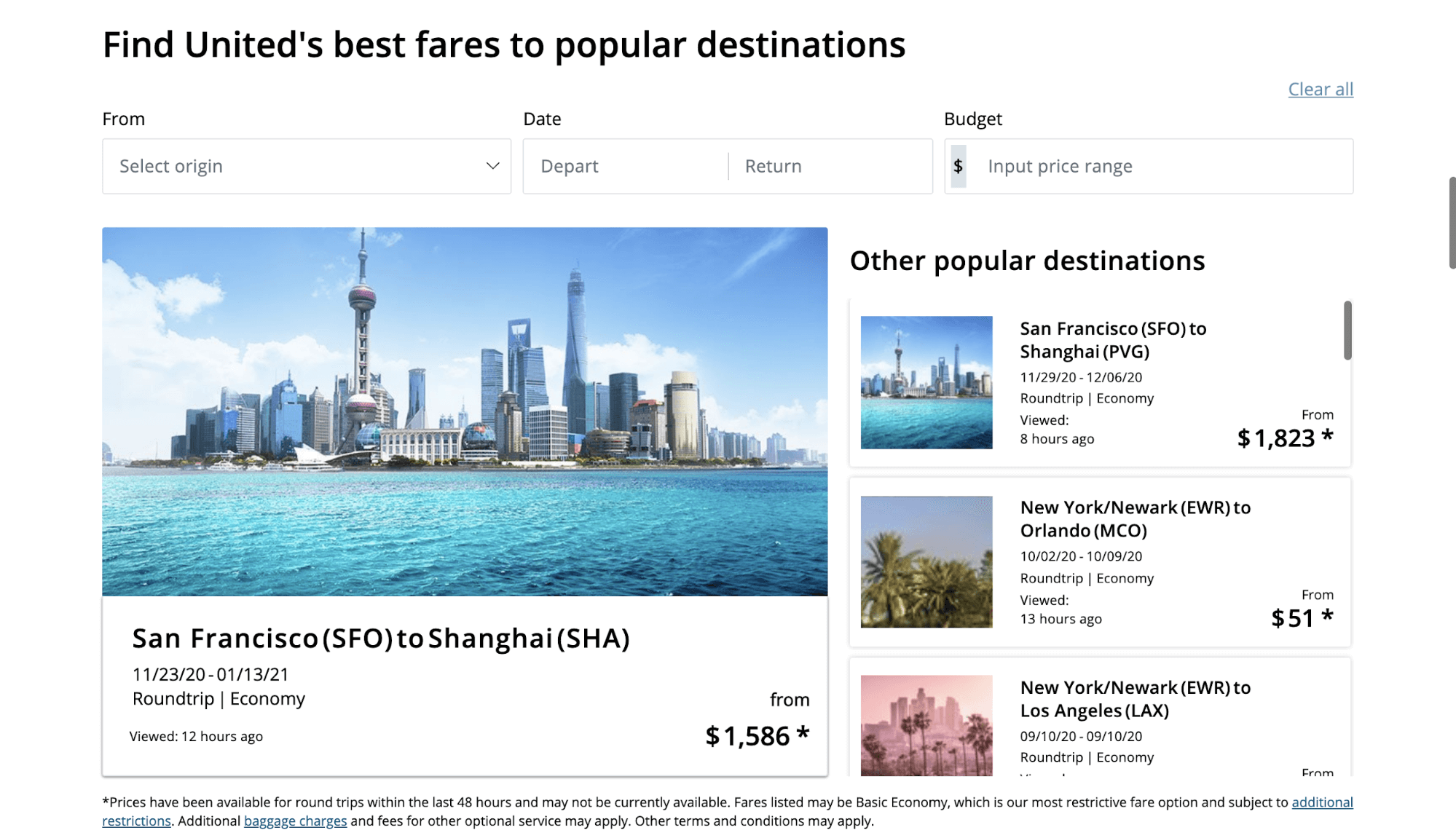
On United's Deals and Offers page, users can select a variety of parameters to help them easily narrow down packages and deals based on their specific criteria. Each deal clearly states the booking window, origin, destination, and price, helping users quickly scan results and find the most relevant offers for their needs.

3. Progressively guide users down a booking flow made for deals and destinations

Don’t expect users to jump on a deal right away. Progressively disclose information about a specific deal or destination, rather than expect users to book instantly. 

Although the booking engine should be available at all times through any journey, give users a chance to research valuable information on the site, or browse their options. Don’t forget to clearly and succinctly state the terms of the deal to avoid a high dropoff during checkout due to unexpected fees or booking windows.

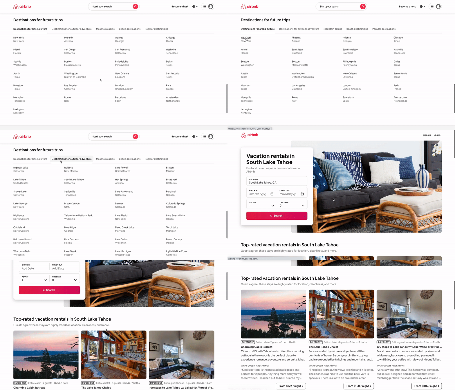
On Airbnb's website, rather than highlighting a small handful of generic ‘popular destinations,’ the brand enables offers users a no-frill destinations chart on the homepage that tabulates a list of popular destinations with different characteristics. Users can easily pick a destination that meets their specific criteria and needs. Once a user chooses a location, they are brought to the destination page that is pre-filled for their convenience. Underneath, they are provided a variety of suggestions for top rentals in that location.

4. Use industry knowledge to bring value to your users and increase brand credibility

The travel industry can be daunting, and your site may encounter many new users during the peak shopping season as it did during the pandemic (75% of consumers have tried new shopping behaviors, methods, brands, and places during the pandemic). 

As users typically expend high effort to research the best offers and booking windows—from travel blogs, influencers, to friends and family—there is a unique opportunity to help consumers with already-existing knowledge about travel trends. Make it easier for your users to make decisions by providing valuable travel and booking tips, based on historical data. Helping to inform users may potentially reduce exits and speed up the decision-making process.

On Kayak's website, when users choose a destination deal to explore, they are brought to a page that provides them travel tips and historical information based on the specific flight that is being viewed. For example, users can find the off-peak month, peak month, average prices, price estimations, tips, and FAQs for flights and airports of the chosen destination.

Although booking travel can be hectic during the holidays, travel companies have a clear opportunity to optimize travel deals and easily guide users to find and book the best vacation packages. Carefully curating deals and creating a smooth browsing experience will help create a stickiness that has users come back again.