Leeds Building Society

Increasing conversion on key savings pages

CONTEXT

Keith is Head of Digital at Leeds Building Society (LBS). 

When reviewing site performance, Keith’s team noticed that their conversion rate was low compared to some of their competitors. They decided to analyse user behaviour and see if users were following the sales path as it was designed.

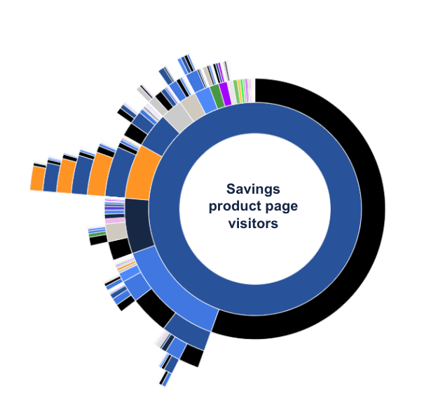
Journey Analysis shows looping between full savings range (blue) and product pages (orange)

INSIGHT

Using Journey Analysis, they discovered users were not following the ideal sales path. Instead, users were moving from product pages to the product homepages and back again — looping between the two before exiting the website.

HYPOTHESIS

The team hypothesised that this behaviour was caused by users trying to compare products, so they decided to look deeper at the journeys of a specific segment: users arriving from comparators. They found that many of these users were leaving the website right after landing on a product page. 

Keith’s team knew they needed to remove distractions in the acquisitions journey and to provide a better approach to legal requirements versus visitor experience in order to improve overall conversion.

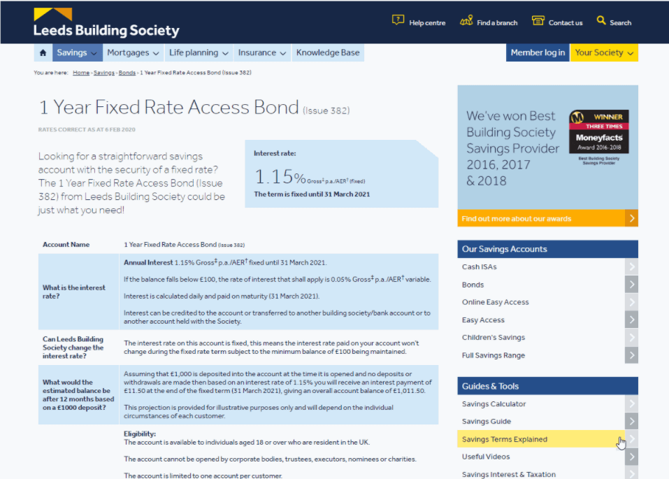
Exposure Time on the Cash ISAs page

ANALYSIS

Using the Exposure Time metric in Zone-based Heatmaps, they were able to identify which areas of the product page were being interacted with the most, and which were causing frustration — noticing that users were spending a long time reading product pages, which were typically long and text-heavy.

ACTION

The team were able to present this analysis back to their legal department, who were hesitant about simplifying the legal information on the product pages. By clearly showing the lack of user engagement on the page, they were able to convince them that the product pages needed restructuring.

As a result, the LBS team...

1.

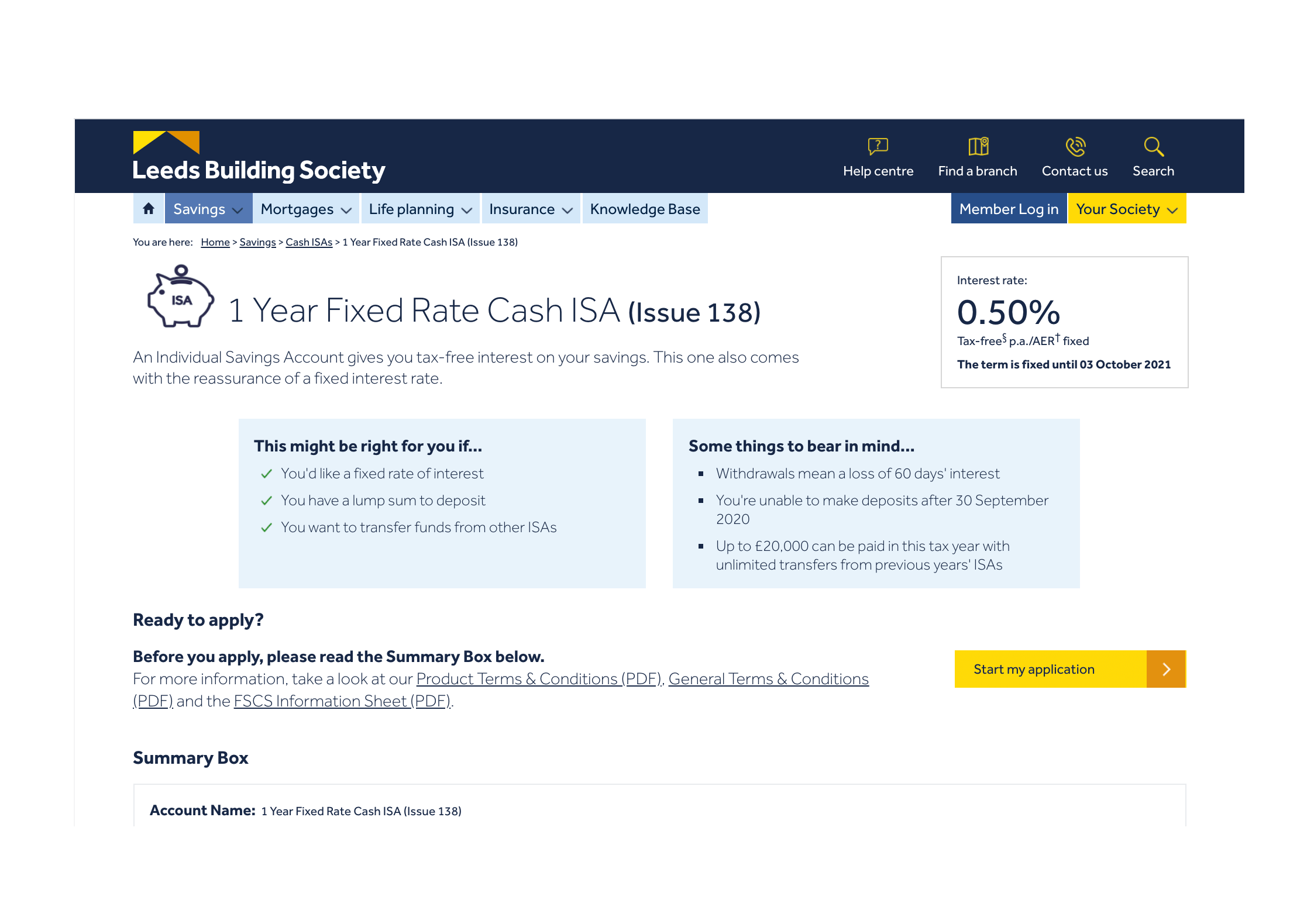
Redesigned their product homepages

Before

2.

Redesigned their product pages

After

3.

Introduced a Comparison Tool

RESULTS

The changes led the average conversion rate of product pages to increase by  40%

And for some product pages, that conversion rate increased by  80%

"
As a UX designer, Contentsquare is one of the most important tools I have to make design decisions. I base much of my design work on the data I get from Contentsquare and then also use it to test whether my pages are doing what I thought they would. I use Contentsquare every day and I’d be lost without it. Also, the support we get as a client is amazing. Morgane is so helpful and is a real asset to us at LBS."
Leeds Building Society

Rosie Dent-Spargo

UX Designer
Leeds Building Society

Ready to get insights faster?

Request a demo