Methodology
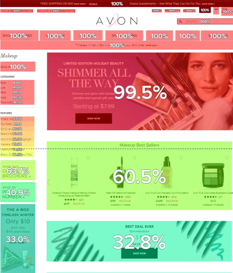
The team decided to run an AB Test on the page to determine whether reducing the height of the banner and bringing the product carousel higher up on the page would translate into a healthier exposure rate, more engagement and an improved conversion rate.
It wasn’t the first time that the team had considered making the banner smaller, but up until now there had been no data to back up such a decision. The team was also concerned about devaluing the banner image so it was important to test before rolling out any changes.
During the test, the team analyzed exposure, clicks, scroll, time spent, and bounce and exit rates. They also took into account conversion metrics.


