Leveraging customer behavior insights for a standout brand experience

The Challenge

The team at GoPro wanted to increase direct-to-consumer sales, which afford the brand the best margins and more control over the total customer experience.

At the same time, because some GoPro.com visitors will choose to complete their purchase through a GoPro ecosystem partner, the company needs to engage and influence all site visitors to prefer GoPro cameras regardless of where they choose to shop.

The GoPro.com challenge embodies a formidable dual goal: to facilitate conversions on the home site, but also to educate and inspire visitors about the brand and products, and to take them as far down the decision journey as possible even if they choose to convert elsewhere.

As a lifestyle brand built on video storytelling and beloved by experience-seekers, the digital team knew that the product and content were inseparable, and so a successful site for GoPro would not follow a traditional eCommerce design.

In practical terms, this meant going up against accepted eCommerce UX standards of a streamlined interface, opting instead to wow visitors with rich, visual, interactive content. At the same time, navigation had to remain as friction-free as possible to encourage direct sales.

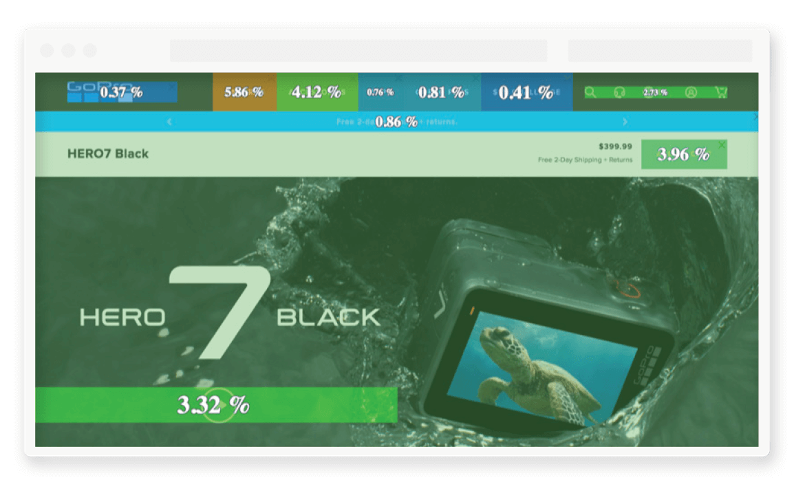
zoning go pro

THE METHODOLOGY

With the Hero7 camera driving the lion’s share of revenue for the brand, the digital team at GoPro decided to tackle this heavily trafficked page first, and to redesign it to showcase the brand’s bold new creative vision. Since the team was navigating uncharted waters with this content-heavy approach, it needed to understand intimately how this content was impacting visitor engagement and conversion.


The team used the customer journey analysis feature and sunburst visualization to understand how the product detail page fitted into the larger visitor journey. They then drilled down into in-page behavior — analyzing Engagement, Attractiveness Rate and Click Rate among others — to see which elements triggered interactions and which caused visitors to exit.

Based on this approach, the digital team was able to answer the question of how much content to push and how far to go with the redesign— in the end opting for a ‘more is more’ approach in line with the expectations of an audience hungry for inspirational content.

"Contentsquare has made our lives so much easier — not only can we see how each element of content performs, it also shows us how visitors journey through the site, giving us all the information we need to make decisions confidently. The visualization makes the data easy to consume, and today the team uses Contentsquare as part of its daily decision-making process and whenever we are thinking about UX design."

Eumir Nicasio

Head of Product, Digital & eCommerce,
GoPro

The Outcome

Being able to underpin creative decisions with customer behavior insights gave the digital team
the confidence it needed to go bold and make the experience more customer-centric.

After launching the newly-designed page, the team noticed an 80% increase in conversions from the product detail page.

The success of the Hero7 product detail page was only the first step, and the Digital and eCommerce team at GoPro continues to integrate Contentsquare into all its design processes and experience strategy.

From site evolution to the day to day merchandising strategy, the tooling and insights Contentsquare provides has empowered the team to hone in tightly on small and large challenges, and confidently make decisions towards solutions.