CHALLENGE

Test drives are a key stage in progressing the customer car purchase journey. With much pre-purchase research taking place online, test drives are increasingly booked online also. Car marque websites are also the perfect place for prospective customers to visualise how their dream car might look and feel, and online tools such as the ŠKODA Toolkit (including a Car Configurator and Finance Calculator) facilitate this.

ŠKODA’s goal was to optimise customer experience with their brand online, with a particular focus on increasing the number of test drives booked via the website.

ŠKODA’s challenge was to understand:

  • What are the most critical areas of the website creating navigation barriers for customers?
  • Where is the biggest opportunity for improvement?
  • What types of interaction have the highest correlation with booking a test drive?

ŠKODA UK wanted to encourage visitors to request a test drive by increasing the number of interactions with ŠKODA’s Toolkit, including the Finance Calculator, Find a Retailer and Car Configurator functionality.

APPROACH

At the beginning of the engagement, the Merkle team built a measurement framework - a map of the metrics that are critical to ŠKODA’s success. The visualisation allowed Merkle's analysts, working closely with ŠKODA’s digital transformation team, to translate their business objectives into web analytics metrics and prioritise optimisation based on the performance of these data points.

As one of Contentsquare’s Partners, with more than 6 certified analysts, we supported the ŠKODA team (led by Chris Whitmore) to champion the use of the platform in investigating the challenge they were confronted with. We conducted a very in-depth piece of analysis using both Google Analytics and Contentsquare which uncovered the following customer problems:

  • Users did not have clear next steps when interacting with the new car pages
  • User displayed looping behaviour between pages, which is a sign of confusion
  • Users were abandoning journeys, due to distractions in the pages

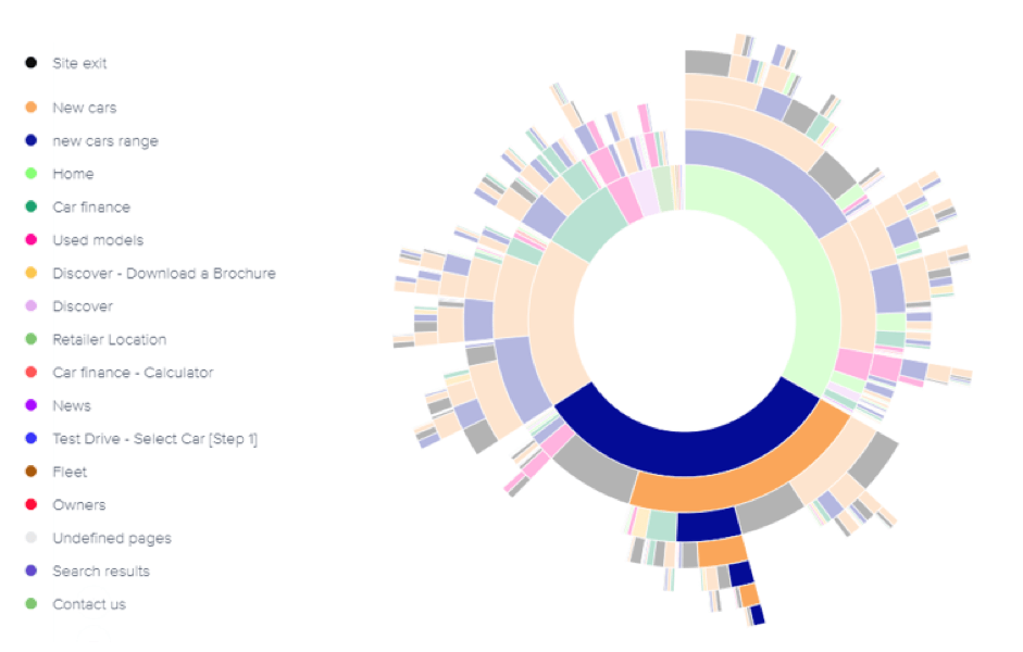
The detection of many users looping back and forth between the homepage and the new cars page suggested they were struggling to find key information and weren’t able to navigate the ŠKODA UK site easily.

Journey Analysis shows users looping between the Homepage (green) and New Cars page (orange).

FURTHER INSIGHT

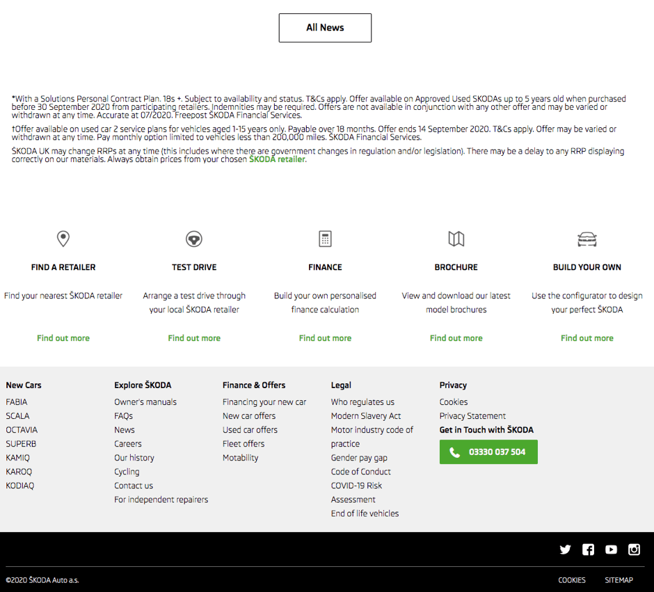
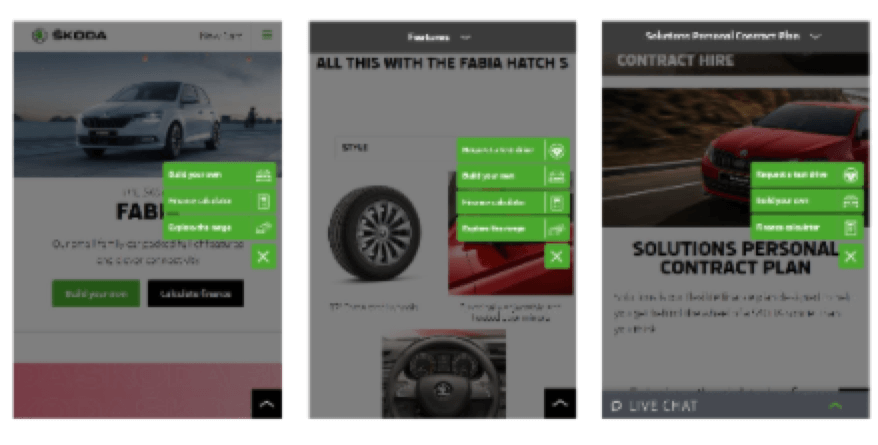
The Click Rate metric in Zone-based Heatmaps revealed that very few users were clicking the Toolkit (pictured), hidden at the bottom of the homepage, leading to a lack of clarity in a user’s journey.

The Toolkit appeared at the bottom of the page

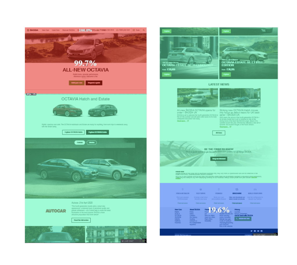
Exposure rate on the range page, showing only 19.6% of users reaching the Toolkit at the bottom of the page (blue)

Click rate on the Toolkit showed very low engagement.

ACTIONS

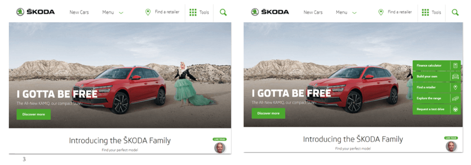
These conclusions led the team to highlight the visibility of the toolkit by implementing a 'sticky tools' navigation on the right side of the page (in green).

RESULTS

Our actionable insights, created using Contentsquare and Google Analytics, drove a +40% increase in test drive visits. Chris and his team were also delighted to have generated a +10% increase in visits to the Finance Calculator, +12% visits to Find a Retailer and +3% to Car Configurator.

Through use of the right data to understand different customer problems and designing solutions that are aimed to solve these, we have seen tangible results with a real impact on ŠKODA’s bottom line – test drive visits have been significantly boosted. We also experienced benefits in solidifying intent to buy, shown by the increase in visits to the Finance Calculator, Find a Retailer referrals and the lift in visitors to the Car Configurator.

FURTHER ANALYSIS

As we go on to test further hypotheses with ŠKODA, we will continue to build on these initial successes. Our next hypotheses to test are based on further analyses of users’ behaviour on the homepage.

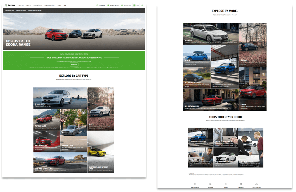
Our first hypothesis is that whilst the sticky navigation is successful in engaging and driving users to explore ŠKODA’s range, the range page acted as a point of friction for users.

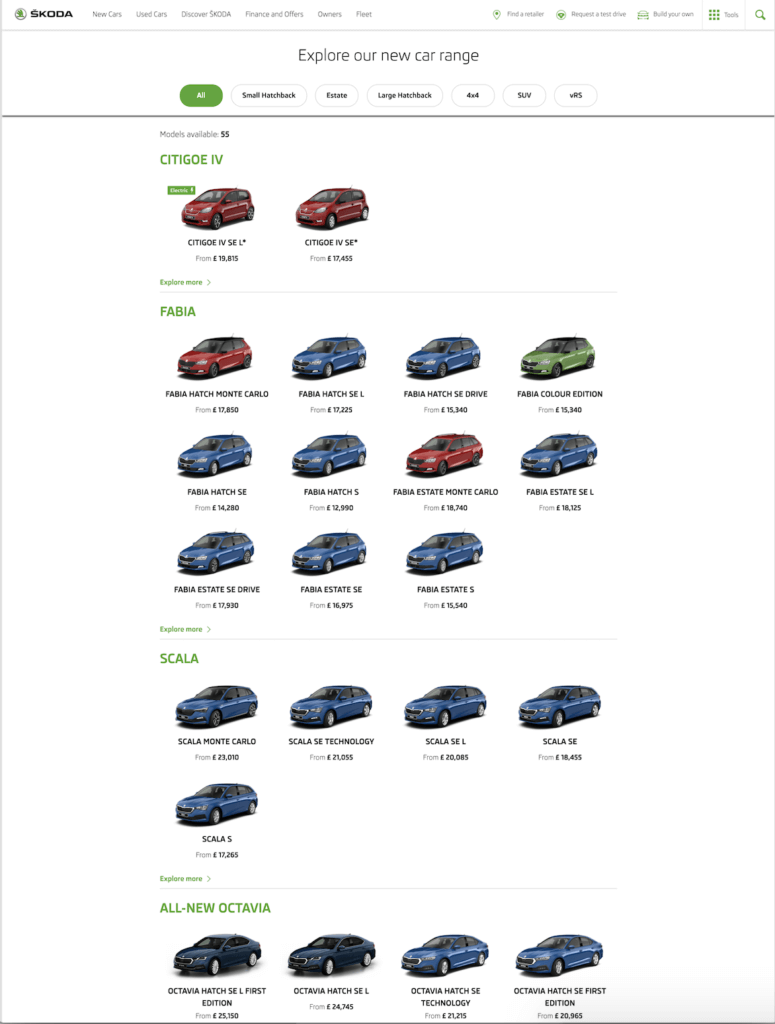
Skoda's old range page

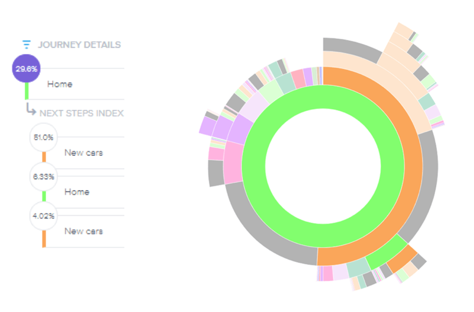
The Journey Analysis confirmed this behaviour. Chris’s team were able to segment users who visited the range page and analyse how they navigated through the site. This revealed a large proportion of users looping from the homepage to the range page and back, without progressing further — confirming the hypothesis.

Journey Analysis showing just users who visited a range page. These users continued to loop between the new cars range page (blue) and the new cars homepage (orange).


After further analysis, the Time-before-first-click metric in Zone-based Heatmaps showed users took a long time before interacting with the filters at the top of the page. 

But the Click Rate metric showed these were one of the most attractive elements on the page. This suggested that users were returning to the homepage only after discovering that there is not enough information to help them click through to a specific car on the range page. Hence the ‘looping’ behaviour.

The team have already created some new test ideas using this insight, including re-ordering the sticky nav bar to highlight the next best action for that particular stage in the user’s journey, e.g. highlighting different actions at different points throughout the journey.

And redesigned the range page to highlight key information about families more clearly.

"
Merkle, alongside Contentsquare, have been instrumental in helping us establish and then accelerate our CRO programme.

They have really opened our eyes in terms of getting the most out of every test and we (the ŠKODA brand, not just the digital marketing team) are starting to see the benefits coming through.

For this test, not only are we now giving customers the right tool options at the right time on their website journey – improving their experience with us and increasing our conversion rates but we are also helping inform and steer ŠKODA’s global roadmap for website developments."
Skoda

Chris Whitmore

Digital Transformation Manager, ŠKODA

Ready to get insights faster?

Request a demo