Product reviews: 6 tips on creating the best review section for your product page

1. Show only a few reviews at a time
You should provide your users with helpful information at a glance but, at the same time, you don’t want to overwhelm them. Therefore, display a minimum of 6 reviews by default, but show no more than 15 reviews by default for desktop. For mobile, show no more than 10 reviews by default.
Implement a CTA that allows users to load more or see all reviews. This ensures that users are not endlessly scrolling down the page, and also ensures that the user can still reach any content below the review section at ease.

On Target’s mobile site, The user sees 8 reviews in the section when they first scroll to it, and can click on the load CTA to load 8 more reviews.
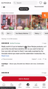
On Sephora, six reviews are shown on the page by default. Too few reviews may require too much effort from users, having them click on the button to load more, while too many reviews can overwhelm the user.
2. Provide only relevant details about reviewers
Avoid asking and displaying unnecessary information; only provide details of the reviewer that are most needed and relevant. Also, show this information in a digestible format that is easy to skim.
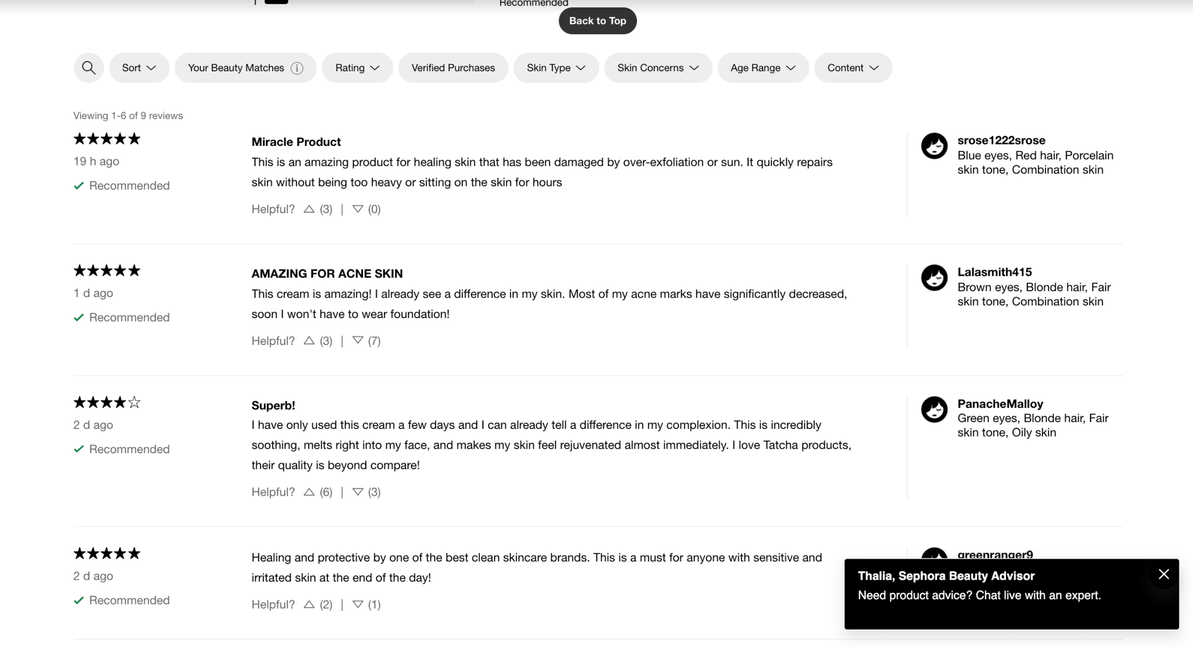
Relevant information about the reviewer, such as eye color, hair color, and skin type, is listed on the right-hand side of Sephora’s review listing.
3. Product reviews: include additional features to increase reliability
Reliability is key for a good review section. Indicate which reviews come from verified purchases to further inform the readers that these reviews are trustworthy. Clearly label on the review that it is a ‘verified purchase’ or from a ‘verified buyer,’ and make the label easily identifiable with a distinct color or a checkmark.
Additionally, implement a system that can allow users to vote reviews as ‘helpful’ or ‘not helpful.’ Allow users to see the total number of ‘helpful’ and ‘unhelpful’ votes. With this, users can then see which reviews have helped other users, and decide on which reviews to trust.
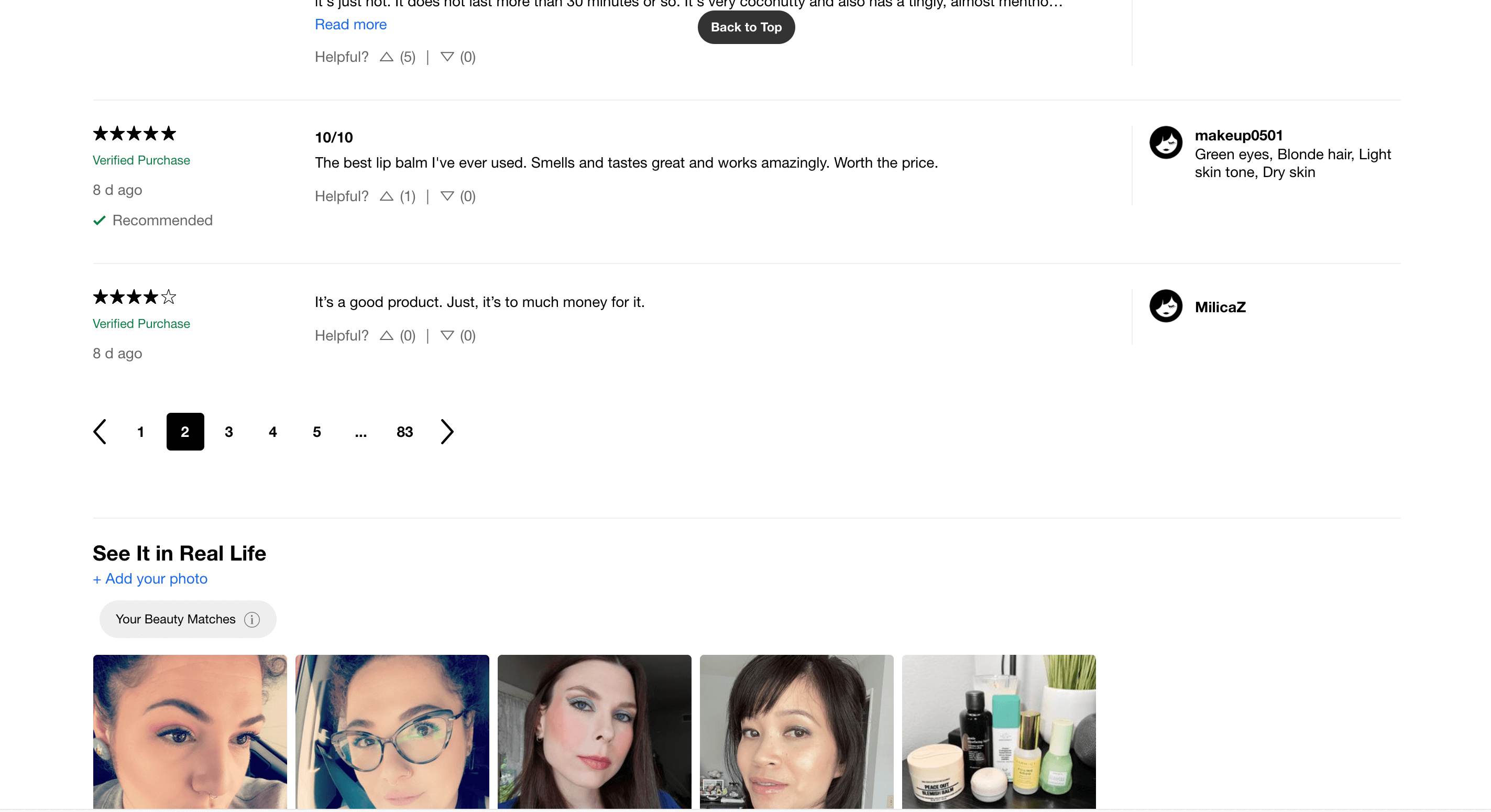
Sephora informs the user of a verified purchase by writing a green “Verified Purchase” label with the review. Users can also vote the helpfulness of a review by clicking on the up and down arrows. The total counts for each upvote and downvote are shown in parentheses next to each arrow.
4. Explore different formats and layouts
There are different formats and layouts outside of vertical lists you can explore when implementing a reviews section. Consider using a popover to display reviews. This avoids extending the height of the page, and allows the user to easily exit when they are done.
Displaying reviews in a horizontal format also works very well. Allow users to view these in a carousel or navigate through them page-by-page. This conserves space on the page, and avoids having users scroll through. Again, make sure to show only a few reviews at a time. Use a ‘load more’ button or ‘see all reviews’ buttons below this section to see more reviews.
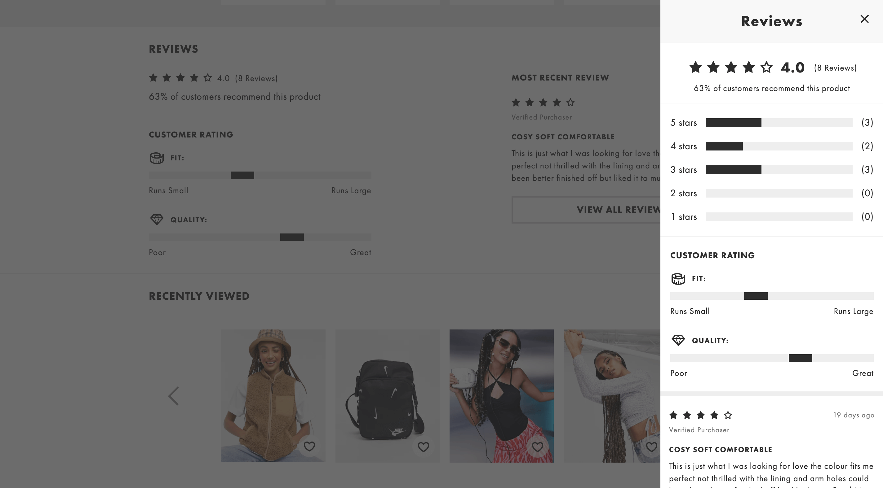 Everlane shows their reviews in a horizontal format, which conserves space on the page. Although it does show fewer than 6 reviews at a time, clicking on the carousel arrow shows an entirely new set of reviews rather than showing them one-by-one. When clicking on the ‘View All Reviews’ button, the user can view a popover to scroll through more reviews
5. Respond to negative product reviews
If you get any negative reviews, don’t ignore them, but write a response to ensure that other users understand you care about any problems with a product. Make sure to address the specific problem at hand, communicate the actionable steps that will be taken with the provided feedback, and contact the reviewer or leave contact information.
More than half of consumers expect businesses to reply to negative reviews within a week (ReviewTrackers, 2018). It is important to respond to any negative reviews to avoid having it affect the way other readers will view the product and even the business itself.
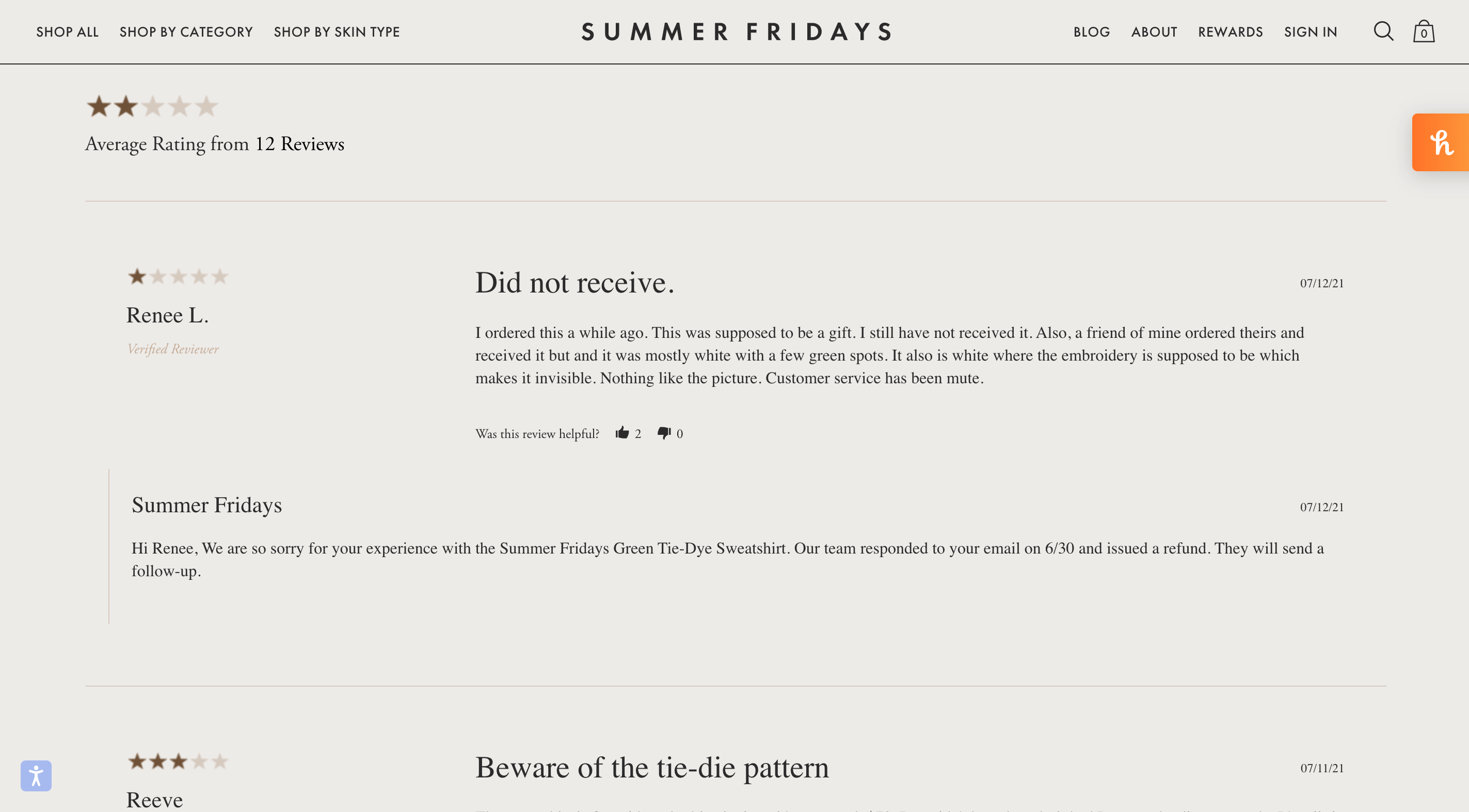
The Summer Fridays team has left a response to the one-star review by addressing the specific problem, communicating what’s been done with the feedback, and the steps they will take afterwards.
6. Include a section for Q&A
By including a Q&A section you ensure that users can easily find answers to any questions they may have or ask their own. Consider also having a quick link for this next to the star ratings at the top of the page so that users can navigate to this section quickly.
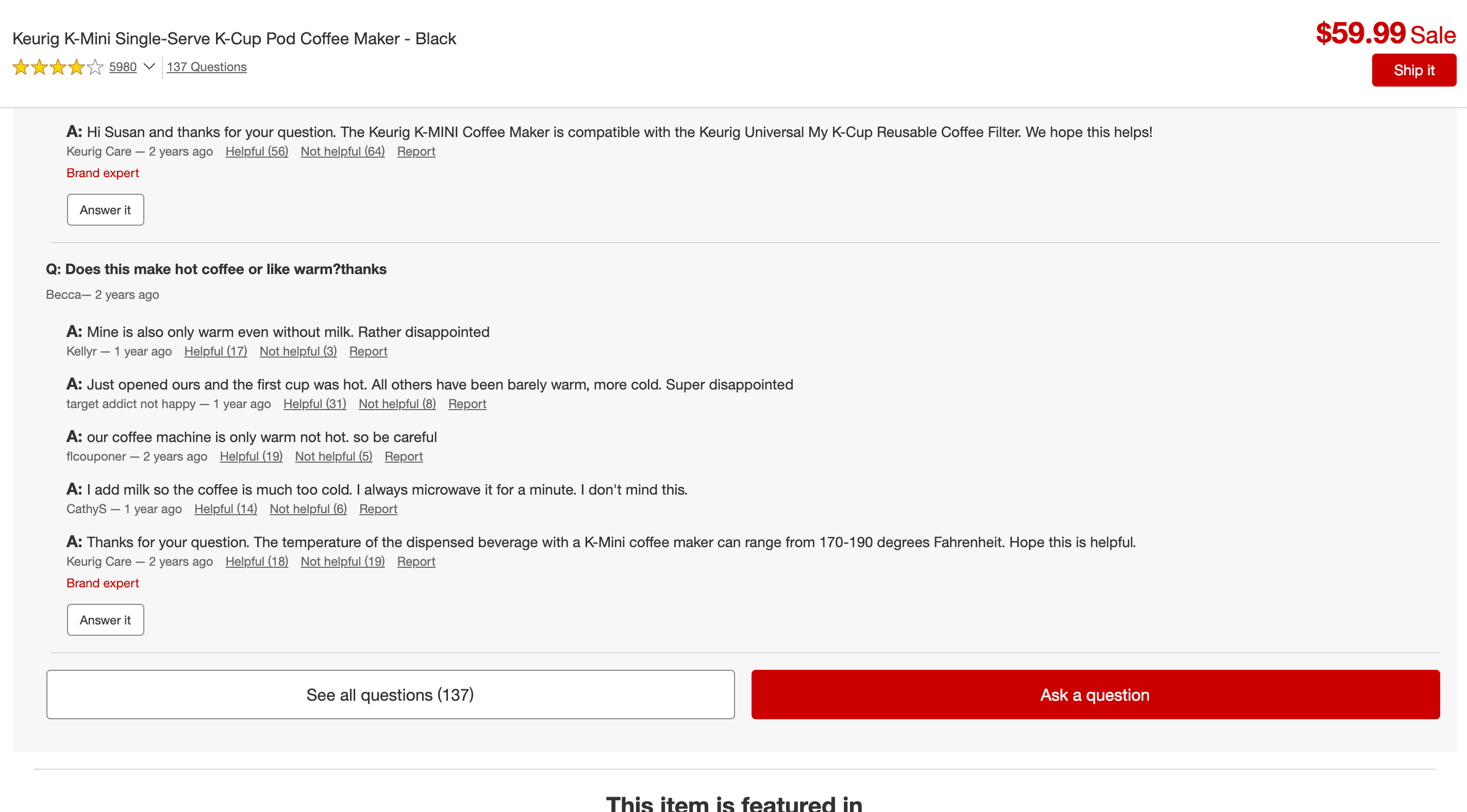
The brand has a tab for Q&A, where users can read and also answer any questions. This section only shows two questions by default, and has two CTAs at the bottom to view all questions and also ask a question.
Conclusion
In summary, reviews are a huge driving factor in a consumer’s purchasing decisions. Make sure to show only a few product reviews at a time, provide only reviewer information that is absolutely necessary, include additional information in reviews to increase credibility, respond to negative reviews, and also have a Q&A section.


