
Take a product tour
Get to grips with Contentsquare fundamentals with this 6 minute product tour.
The company’s collaborative approach has paid off. Thanks in part to its close relationship with other departments, as well as a rigorous testing culture and regular customer contact, Ecosa’s UX team has run a host of tests and experiments that have improved conversion rates.
Speaking at CX Circle Melbourne, Ecosa’s Lead Product/UX Designer Michelle Eynon, shared how Contentsquare’s insights have helped test and validate her team’s UX experiments while drawing on customer insights to create a seamless digital customer experience.
Here are four strategies Ecosta has used that you can follow to emulate their success.
Social proof and intuitive navigation are two things customers look out for when buying a product from your company.
But what’s the most effective way to bring them together in your UX designs?
You might have assumptions about that, but they will need to be validated. And that’s where testing proves invaluable.
According to Ecosa’s customer research, customer reviews and star ratings help customers decide on purchases.
The team hypothesized that making product reviews more visible would positively affect customer engagement.
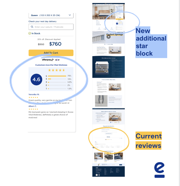
Ecosa’s new product tile
Ecosa’s UX team created a new tile for product pages that summarizes product reviews and highlighted star ratings so customers could see them at a glance.
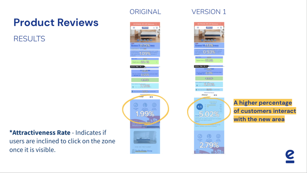
To see if visitors would interact with this new tile, the team A/B tested two versions of it on Contentsquare, tracking attractiveness and exposure rates.
After applying Contentsquare’s Zone Based Heat Maps to the A/B test results, it was obvious which tile was the winner.
Customers interacted more with the new tile when it showcased product reviews and star ratings and were more likely to scroll down to read the information on it. This meant its attractiveness rose from 1.99% to 5.02%.
What’s more, with product reviews and star ratings featured on the tile, conversion rates via rose by 7%
Understanding your customers’ needs presents you with opportunities to help them make informed decisions.
Here’s how Ecosa combined customer journey data from Contentsquare with research to improve conversion rates.
Ecosa’s customer research showed that their customers would research and compare several brands before purchasing.
Michelle’s team hypothesized that providing customers with a comparative tool on their product pages would help drive conversions.
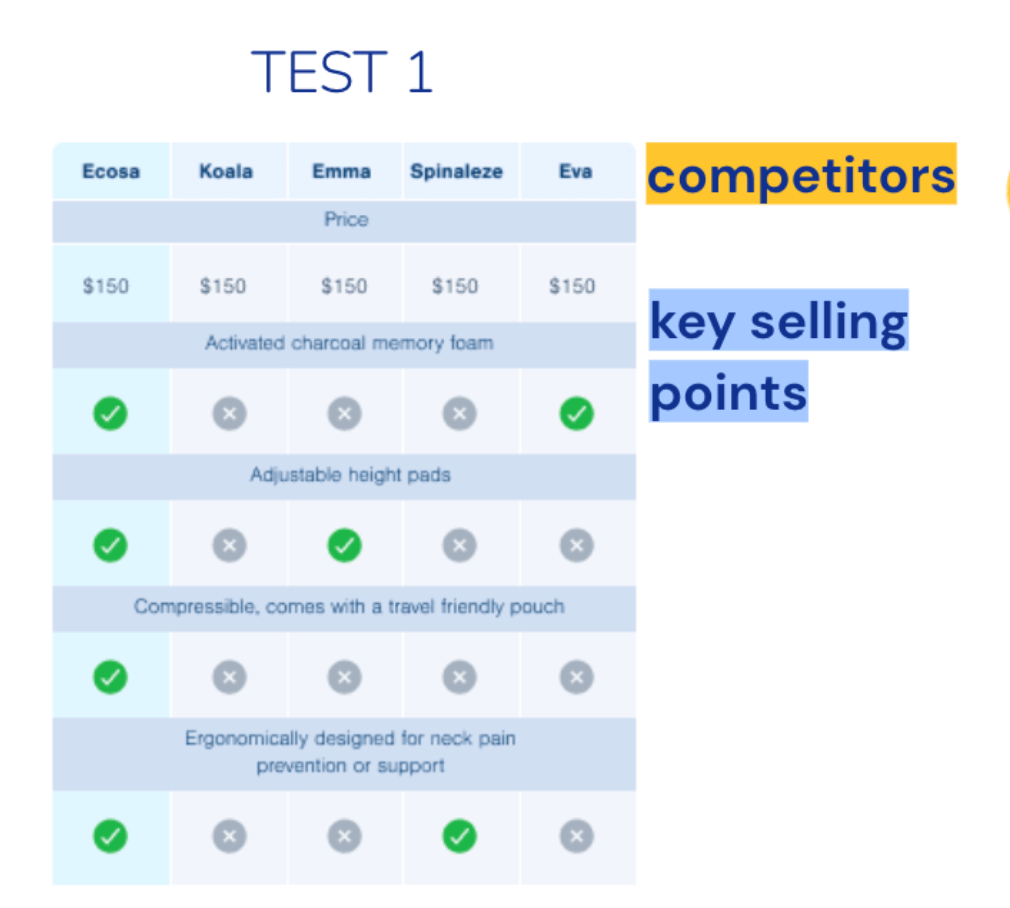
To help customers with their research, Ecosa created a competitive analysis section on the Ecosa Pillow product page, making sure to include key selling points of their pillow products that aren’t supplied by their competitors’ pillow products.

Following positive results on new customer conversion rates as a result of this change, the team continued to optimize.
After seeing high click-through rates on the competitor subhead, Ecosa’s UX team tested a second pillow page variant, further elaborating on how its pillows stand out from the competition, and calling out its trial period return policy.
Using Contentsquare, the UX team found that having a competitor comparison on the pillow product page improved new customer conversions by an amazing 28%.

Both tests resulted in an 18% increase in conversion rate.
Conducting customer interviews and consulting behavioral data aren’t the only ways to uncover customer pain points.
You should also prioritize speaking to your customer-facing teams, such as customer service, product and procurement.
Here’s how an insight from customer service helped Michelle’s team improve conversions by 8%—making their customer service team happier in the process.
Ecosa’s customer service team brought it to Michelle’s team’s attention that 3.9% of pre-purchase calls to customer service were querying available sizes of the Ecosa mattress..
Upon inspection, the UX team realized that this sizing information needed to be clarified on the website.
Ecosa’s UX team put together a quick, and highly effective, initial solution – inserting mattress specifications (including sizes) on the website for customers to read.
This quick fix halved the number of pre-purchase calls concerning mattress sizing from 3.9% to 2.1%.

Later, the team created a new information drop-down area (including mattress measurements) as part of a new product page design.
This made that essential information easier to find, further reducing pre-purchase calls concerning mattress sizing to 1.32% .
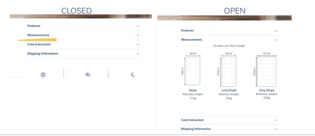
With product information now easy for customers to locate, pre-purchase calls to customer service dropped by 300%—and conversions rose by 8%.
Understanding how your visitors behave on your website is the first step towards deciphering what frustrates them and how they interact with a site to get what they want. And it’s this understanding that informs how Ecosa’s UX team designs the company’s digital experience for its customers.
Customers have low attention spans. They tend to scan, rather than read, your online content. And according to our recent Digital Experience Benchmark report, they only scroll an average of 50% down pages.
It’s essential to make it easy for customers to find the most critical information about the product they’re looking at, ideally without having to scroll.
You might, for example, cater to this behavior by adding a product summary or other eye-catching information at the top of a product page.
That’s exactly what Michelle’s team decided to do, and test.
Ecosa’s UX team worked with its product and procurement teams to create a ‘Best For’ section at the top of each product page, highlighting the key selling points of each product.
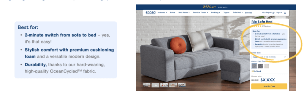
The team ran an A/B test with Contentsquare to validate their new version, comparing conversions, exposure and attractiveness metrics.
When product pages included the product summary up top, they performed significantly better.
Actually, that’s an understatement: They saw 16% conversion rate boost and 173% increase in engagement.
Keep things simple: Not all changes need to be huge. Simple solutions can reap huge rewards without having to take up a lot of time and/or resources.
Stay close to your customers: Regular customer research helps you understand what they’re looking for and will help you develop content that helps them along the purchase journey.
Go beyond data: Customer-facing teams can provide valuable insights on enhancing user experience that may not be evident through data analysis.
Want to see how Contentsquare can help you understand how to optimize your digital experience? Watch the 6 minute demo below. Then drop us a line.
Take a product tour Get to grips with Contentsquare fundamentals with this 6 minute product tour.