Introducing the New Zoning Analysis: Our Signature Feature is now More Powerful and Easier to Use than Ever

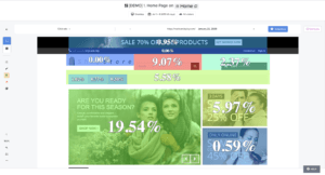
So how did Zoning Analysis become Contentsquare’s most-loved feature? The answer is simple. In essence, you get intuitive and flexible visualizations that tell you why visitors engage, hesitate or get frustrated by overlaying key UX metrics directly onto your website.

With these clear business and engagement metrics, it has never been easier to understand and explain differences in customer behavior. With a clear view of what site visitors find engaging and helpful, versus what might be considered obstacles along the user journey, teams can quantify their content decisions at a glance, and easily get rid of friction. This granular read of visitor behavior also grants brands a way to attribute revenue to their content and UX investments.
What makes all this so practical is that Contentsquare’s single tag captures every single customer interaction, including every click, scroll, hover and swipe. The platform automatically captures behaviors on dynamic content and historical versions of your site, enabling you to jump straight to your analysis.
In a world where every business is striving to exceed the latest standards of speed, ease-of-use and seamlessness, we believe digital CX stakeholders should also enjoy an optimized user experience. That’s why we’ve now made your favorite power tool for in-page analytics even smarter and easier to use.
Say Hi to Our New Zoning
Having worked closely with our customers on a solution that provides answers to real-life use cases, we’ve completely revamped our Zoning Analysis so teams can answer questions faster and even more efficiently.
The new Zoning Analysis is even more tailored to our operational goals: fast and easy to use.
Agathe Orsoni, Digital Marketing Manager at Petit Bateau
We made Zoning Analysis inside the platform as quick and easy to use as CS Live, our nifty browser extension. With our Live Zoning, your website becomes your dashboard. Simply browse your site including dynamic content and drop-down menus, overlay metrics in one click and answer questions on the spot.

Need to dig deeper into the data? Take snapshots to save them into Contentsquare, analyze any element of interest or track its progress regularly.
Comparison Made Easy
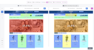
Let’s say you recently launched a new campaign and want to analyze the performance of your hero banner before and after adding a new promotional offer. Or, you just performed an A/B test and want to compare different A/B test elements side by side. By comparing the two, you immediately see why one version performs better and can take actions based on your visitors’ preferences.

Spot a win or a decision you want to celebrate? Simply export your analysis as a PDF to share with key collaborators, whenever you need.
“The intuitive new Zoning allows us to make more detailed analyses especially on CRO / AB Testing subjects where all test variations have to be studied. The new side-by-side functionality allows us to compare the data of each test variation more easily and to learn the best lessons.”
Hazel Dinler, CRO Analyst at Sephora
Ease of use and speed to insights are the key pillars of our new Zoning Analysis. At Contentsquare, we believe in making decisions based on data, not opinion. And we think this level of customer intelligence should be accessible to all. Zoning Analysis was designed to be used by everyone — its highly visual metrics can be leveraged by anyone, not just analysts, and allows everyone on the team to pursue shared goals autonomously.
If you want to learn more about our new, improved Zoning Analysis or if you’d like to see it in action, we’ll be happy to give you a tour!


